How do you look corporate without losing the connection to cannabis?
<p><a target="_blank" rel="noopener noreferrer nofollow" href="https://rivamo.com/en/">Rivamo</a> is a Swiss holding that brought an existing network of businesses under one brand as new regulation opened the door to a more formal cannabis market. The challenge was to make cannabis feel credible: building a brand that reflected the company’s experience and infrastructure while breaking away from the playful, informal codes of the category.</p>
THE SITUATION
What were we trying to make happen?
Make the experience behind the business visible.
Rivamo already had a strong foundation: legal expertise, business experience and technology.
What was missing was a brand that brought it all together and communicated:
We know the market. We know the rules. We're ready to build.
The Idea
What was the idea?
Infrastructure for a regulated cannabis market.
The identity explores the tension between regulation and a market in transformation.
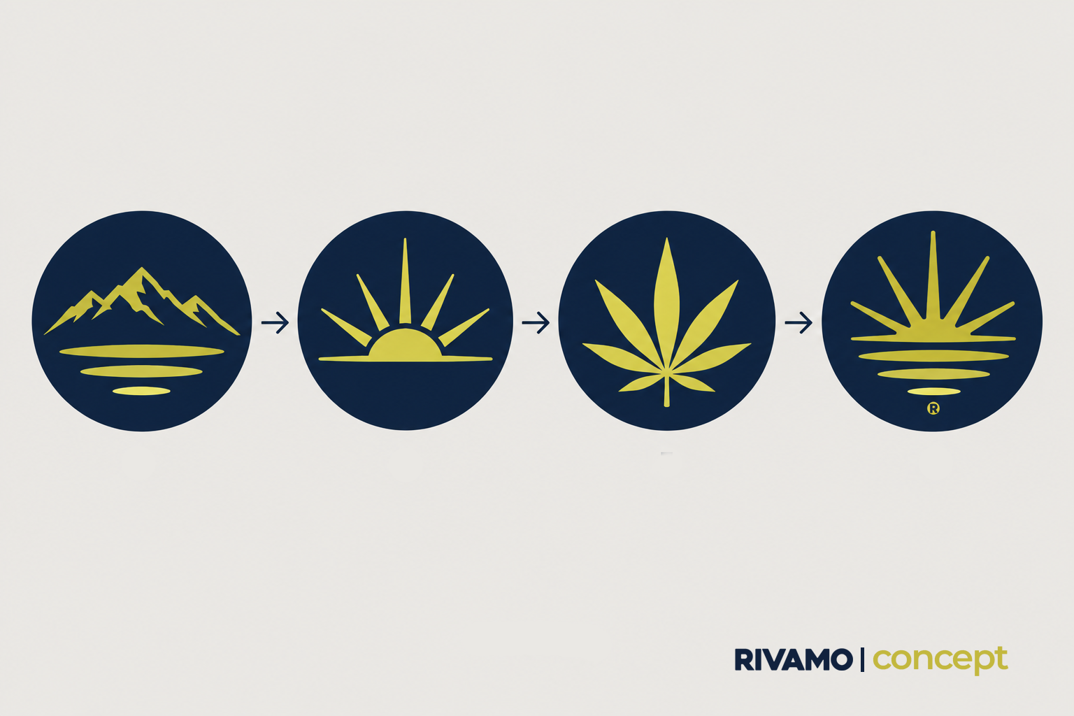
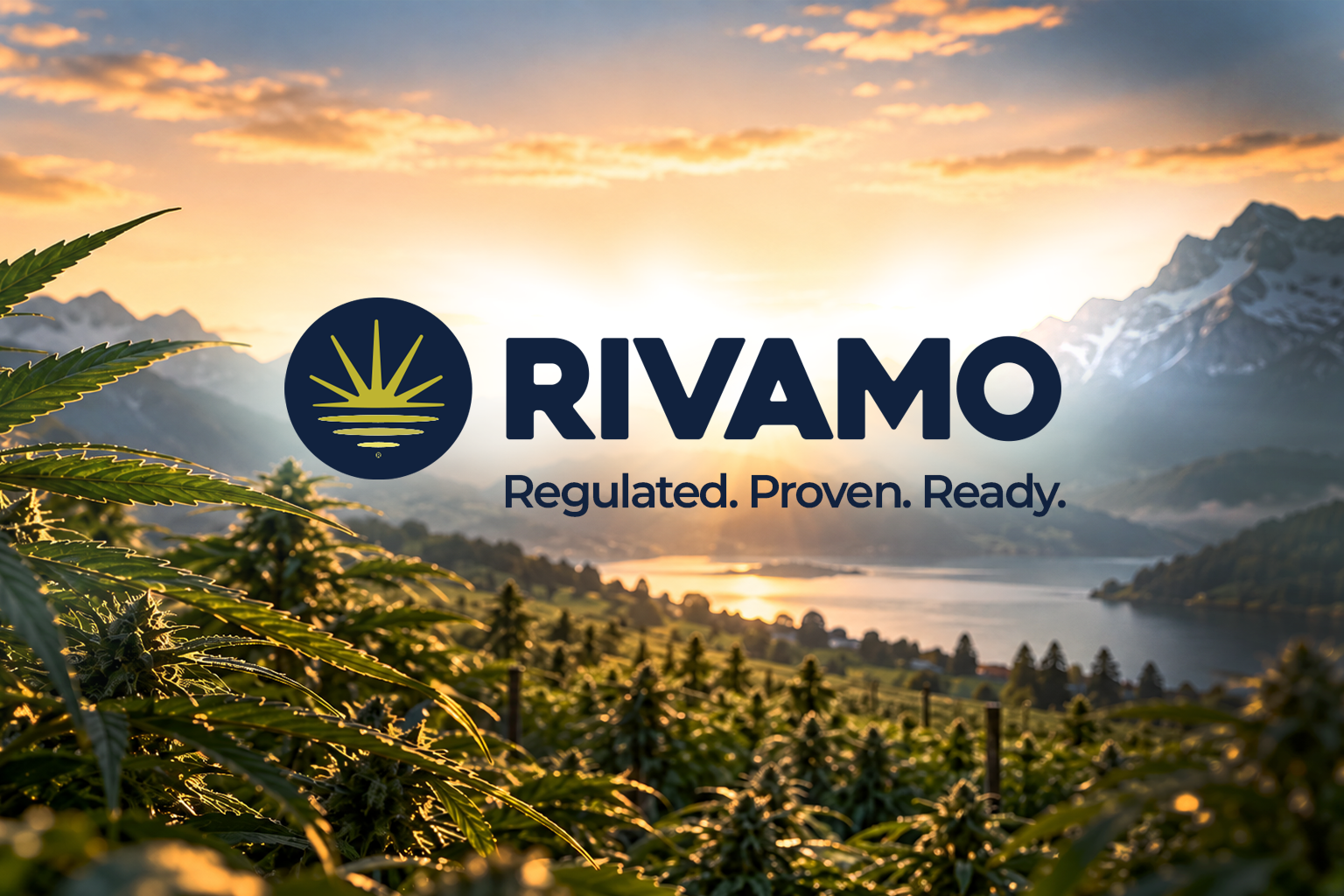
The symbol brings those two worlds together: a cannabis plant, a new sunrise, and its reflection in the water.
The sunrise suggests a new beginning and the promise of what comes next. The reflection connects it to Switzerland, its lakes and its landscape.
The result is a symbol built around balance: nature / structure · growth / stability · above / below.
Direction
What did I design?
Corporate identity
Logo & visual identity
Brand system
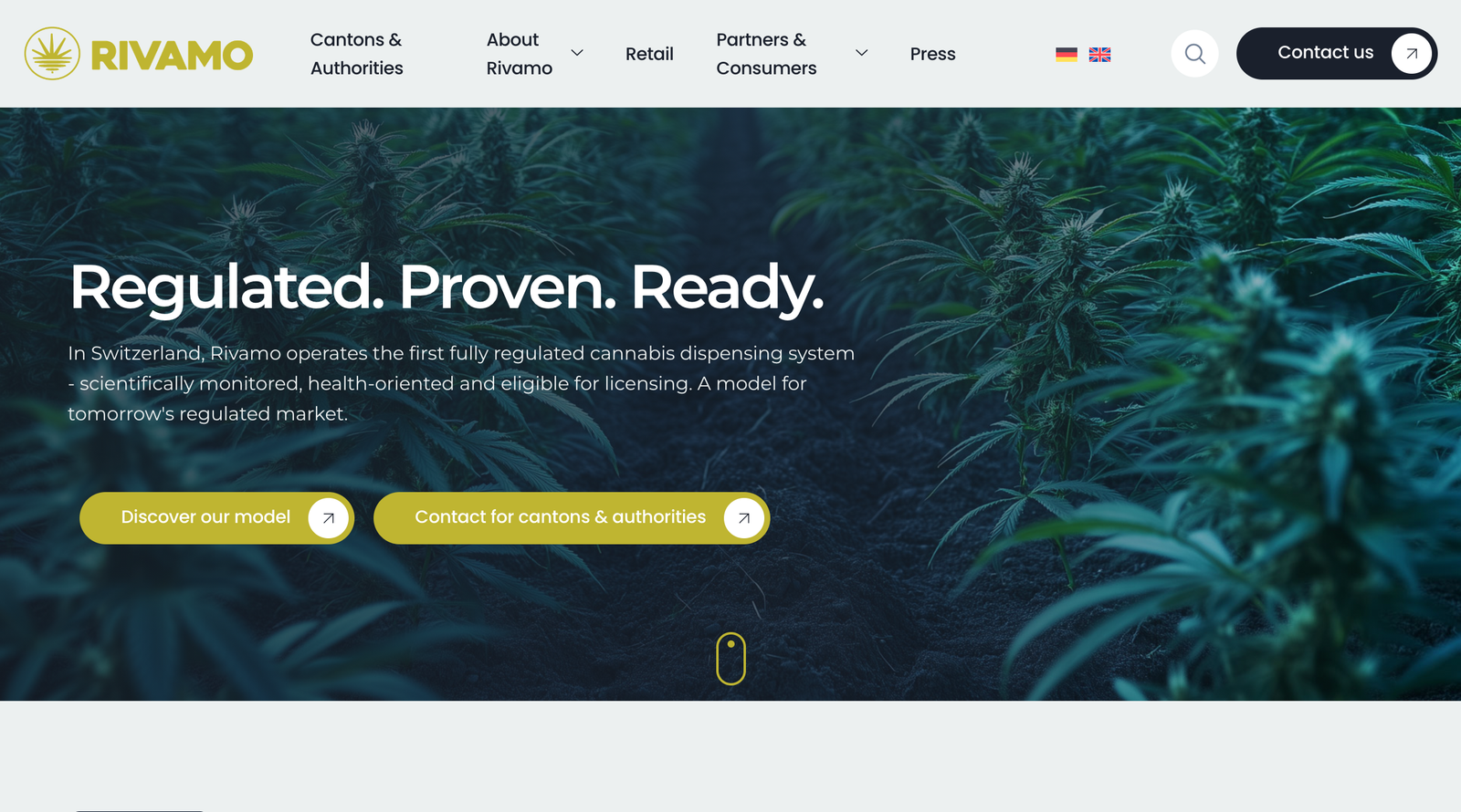
Website
Digital brand expression
System
How did the system work?
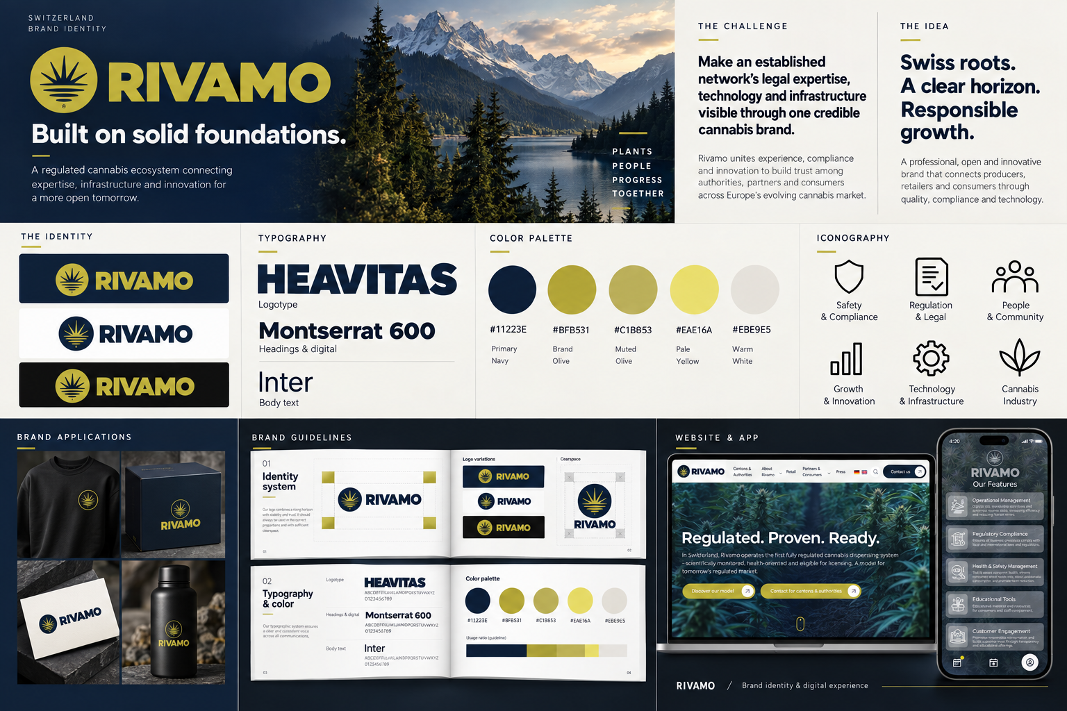
The idea became a visual system, not just a logo.
The system was designed to carry the same balance across the brand:
Logo , typography, color, graphic language Website , brand applications
The visual direction keeps the brand corporate and structured, while maintaining a clear connection to its category.
Impact
What changed?
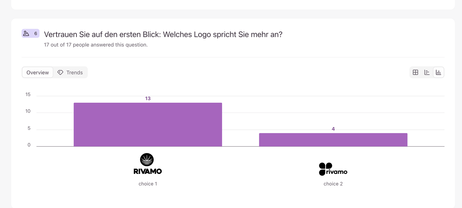
A quick logo test helped the team choose the strongest direction.
17 people
82.4% → associated it with a cannabis business
76.5% → preferred it at first glance
The test gave the team enough evidence to move forward with the first direction.