How do you make cannabis clubs feel welcoming?
JOYN started as an information-led cannabis project in Germany. The goal was to create a recognizable identity and a simple digital experience that could make the topic feel more approachable, help people understand what JOYN was about and invite them to join its waitlist.
THE SITUATION
What were we trying to make happen?
How do you make joining feel approachable?
Cannabis was still surrounded by stigma, misinformation and familiar visual clichés.
JOYN needed to feel open, curious and trustworthy. A place where people could come to understand the topic before deciding whether they wanted to be part of it.
At the same time, the identity needed enough editorial credibility to support JOYN’s longer-term role as an information channel for the community.
Less stigma. More clarity. More connection.
The Idea
What was the idea?
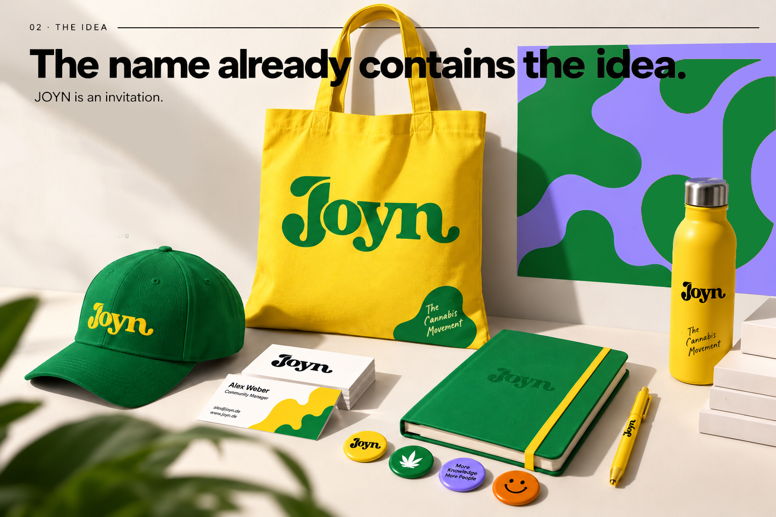
The name already contains the idea.
JOYN is an invitation.
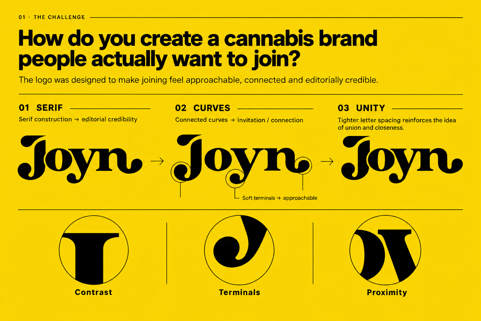
The logo was designed to make that invitation feel visible.
Its connected curves and soft terminals give the wordmark a friendly, approachable character, while its serif construction introduces an editorial quality. A deliberate reference to publishing and journalism.
That balance was important: JOYN needed to feel social and welcoming, but also credible enough to become a source of information.
The visual direction extended that idea through bold color, organic shapes and an optimistic tone that moved away from the usual visual codes of cannabis culture.
People. Information. A more open tomorrow.
Direction
What did I design?
From curiosity to the waitlist.
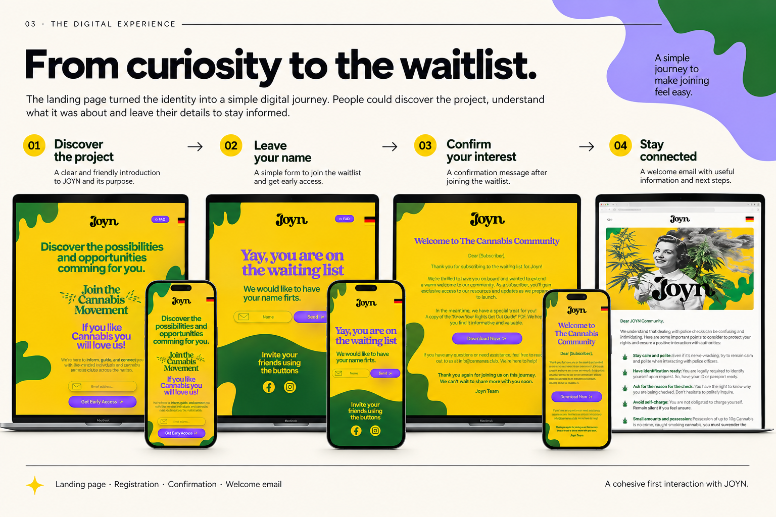
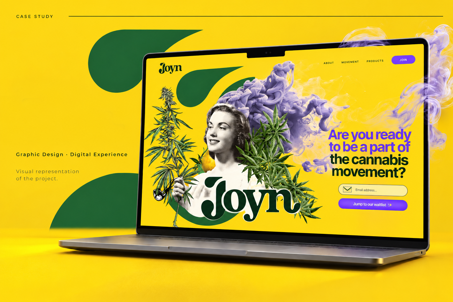
The landing page turned the identity into a simple digital journey.
People could discover the project, understand its proposition and leave their details to stay informed.
The experience was intentionally straightforward:
Discover → Understand → Join the waitlist → Receive confirmation
The landing page, registration flow and email communication worked together as one clear first interaction with JOYN.
System
How did the system work?
A small identity built for a very specific first step.
I designed:
Logo design
Visual identity direction
Graphic language
Landing page
Waitlist flow
Registration confirmation
Welcome communication
Selected mockups were created to explore how the identity could extend beyond the screen and help define its visual personality.
Impact
What changed?
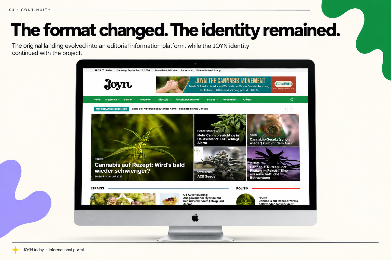
The format changed. The identity remained.
JOYN later evolved into an informational newsletter.
The original landing page and waitlist experience were replaced as the project changed, but the JOYN identity continued to be used.
What began as a simple invitation to join became an identity capable of supporting the project’s role as an ongoing information channel.